McCann
An inventive way to report industry insights.
Overview.
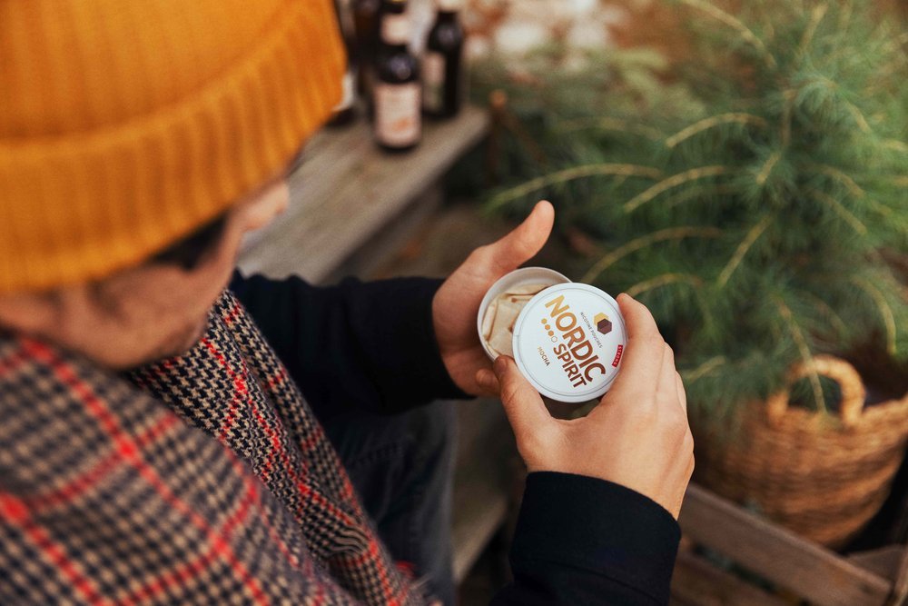
Nordic Spirit are a nicotine pouch brand taking the world by storm as a safer and tobacco-free alternative to smoking. McCann is the world’s most prestigious advertising network, with a history dating back to 1912 and a portfolio of the world’s most culture-shaping campaigns.
As a client, we had been creating competitor reviews for Nordic Spirit as part of a wider marketing and brand strategy. However, with an overload of PowerPoint documents and slide decks, we needed a way to make things fresher and more streamlined.
Role: Account Lead
Sector: Agency
Agency: McCann


Brief.
Every month, our team sent the client a competitor review document which highlighted the latest news in the category, our thoughts and opinions, exclusive content and competitor activity. In a fast-moving industry, these documents provided immense value to stay on the pulse and fulfil their ambitions to dominate the category.
Part of the McCann mantra is going the extra mile, and after joining the team, I knew we could do better. So, after gathering a group together, we set out to reinvent these competitor reviews - and set a standard for the rest of the agency to eventually follow.

Response.
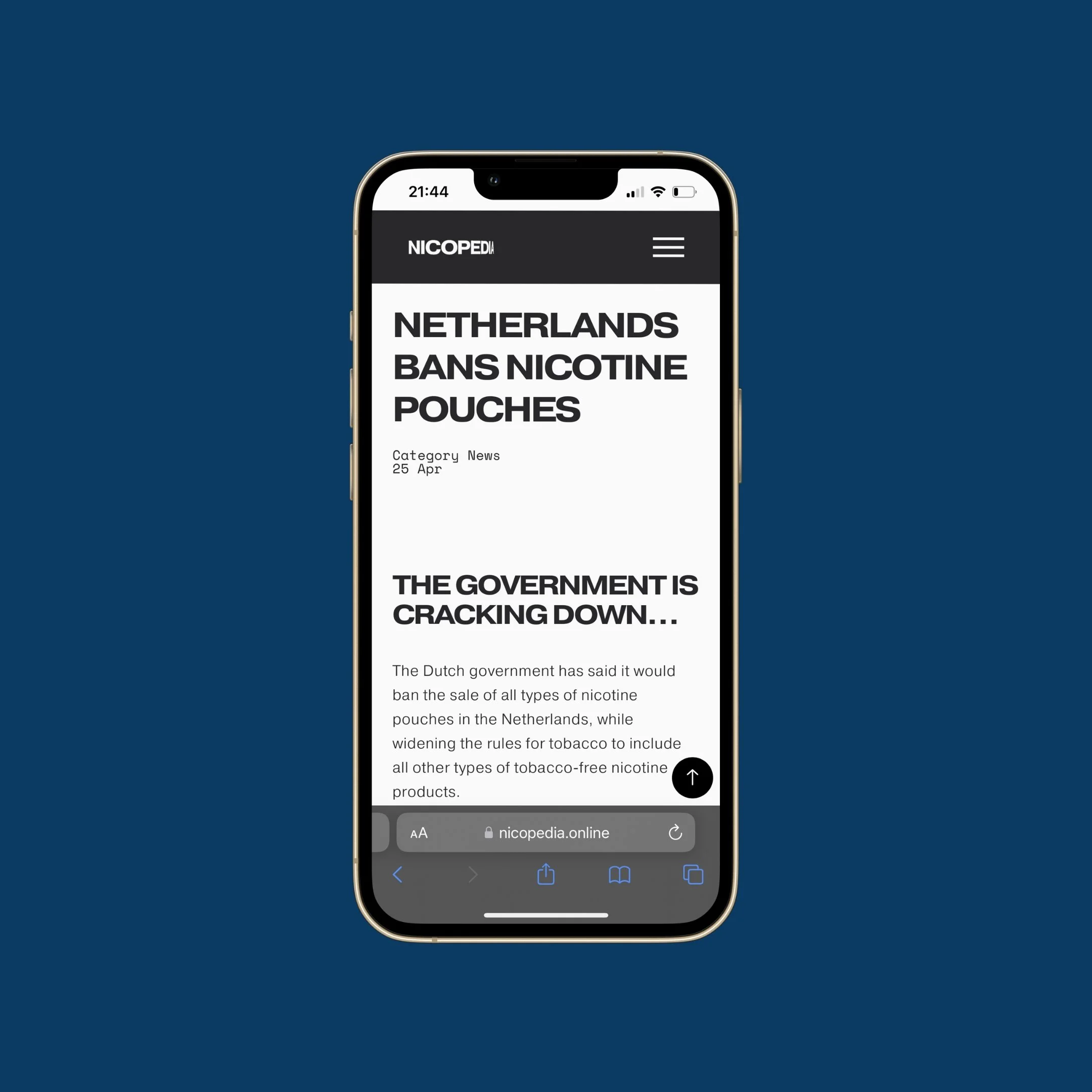
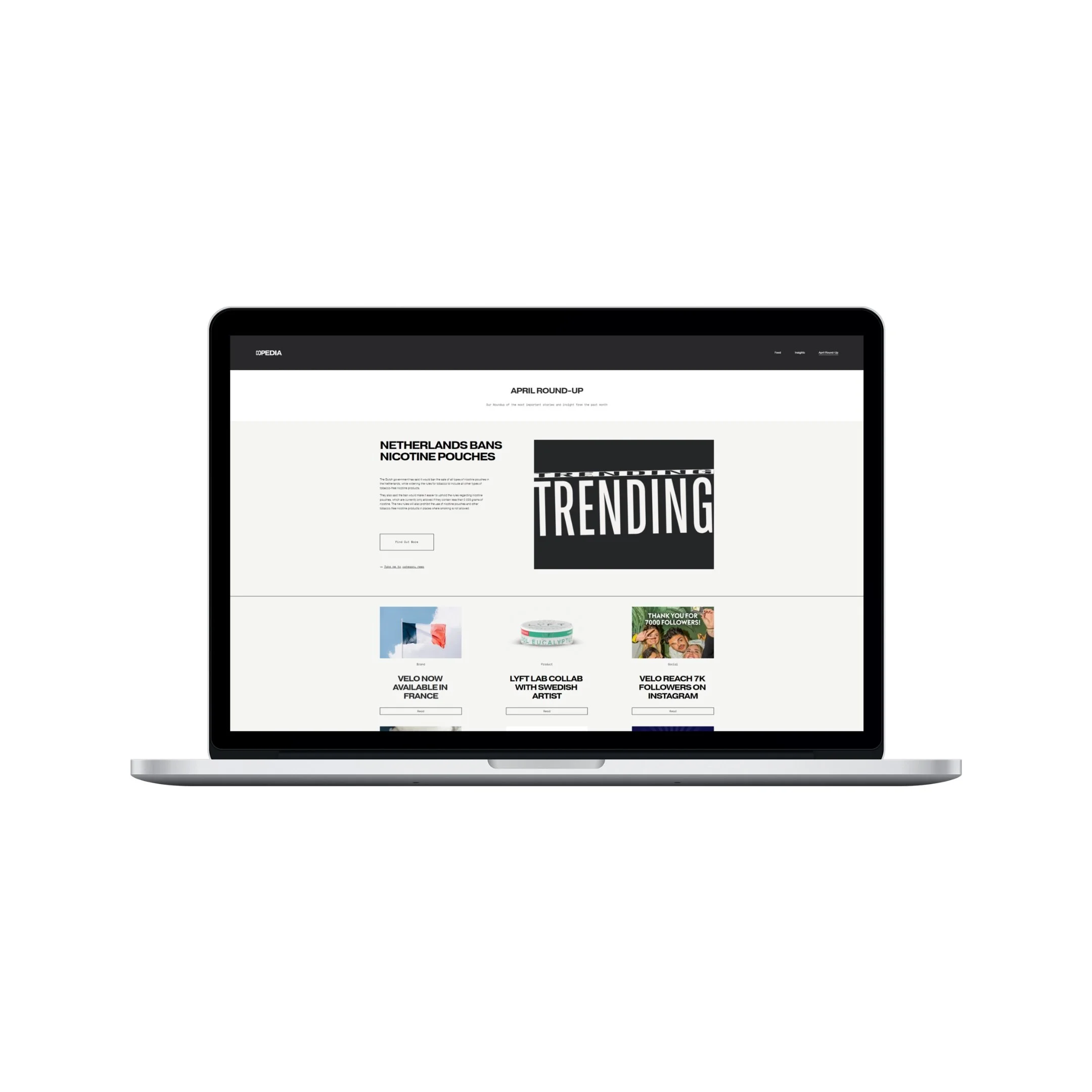
To revitalise what we delivered, my plan was to ditch PowerPoint and embrace digital by creating a fully responsive microsite. This meant no pesky file attachments, faster turnaround, a hub that can be accessed anywhere and gave scope to take what we share to a whole new level.
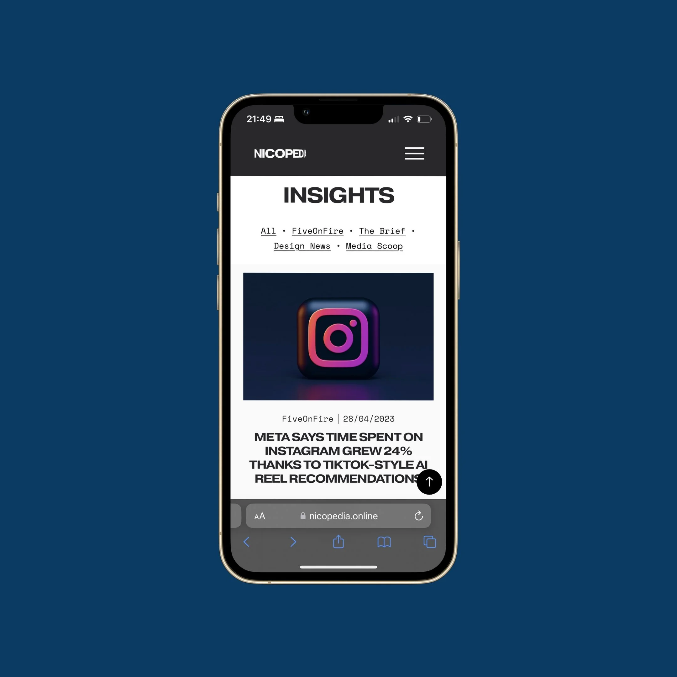
The website would centre around a neverending feed of content, using blog template functionality, and then branch out into other more personalised sections. One of these was a monthly round-up, which pulled content from the feed and allowed us to present a neat round-up of the month in one place - serving also as a historical snapshot for the future. We also showcased McCann exclusives, a ‘meet the team’ section and an area where all previous editions can be downloaded.
In addition to launching a website, we accompanied this with a monthly newsletter which would be sent to the client each month, reminding them to access the site for the latest and greatest.
Working with a Head of Design, we crafted a beautiful modern style which could be rolled out to other brands easily. Using magazines and newspapers as inspiration, our visual identity focused on large typography, a dark colour palette and used animation to make things feel alive.

Results.
This project is internal for the client and is therefore not measured.